Wireframing for SBUX Mobile App

I decided to practice wireframing in Figma with the Starbucks app. I have worked at Starbucks for over 2.5 years, and I have seen plenty of users have issues with our mobile app. The flow of the pages describes an interaction a customer would experience in mobile ordering a beverage and paying for said beverage. I first sketched a low-fidelity mockup of the user flow to map out the layout of the app.
I first sketched a low-fidelity mockup of the user flow to map out the layout of the app.
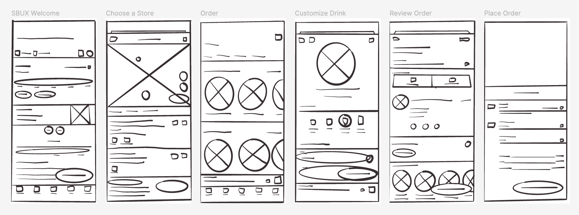
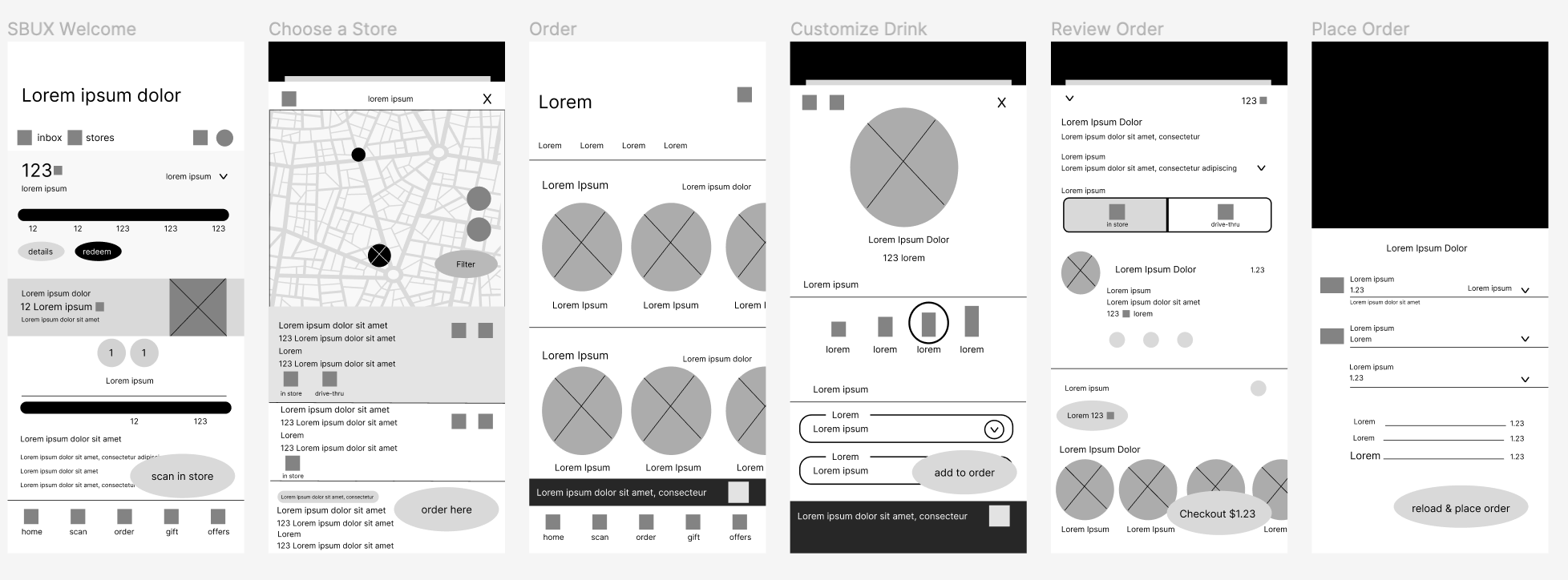
I then created a high-fidelity mockup of each of the pages in the user flow. I enjoyed creating high-fidelity wireframes in Figma. To keep the wireframes consistent across all pages, I used the ‘copy-and-paste’ shortcut a lot; this also really sped up my workflow. Both the low-fidelity and high-fidelity wireframes showed me possible navigation issues that a user might come across on the app. Below I have detailed an analysis for each page.
Page 1: Welcome Page
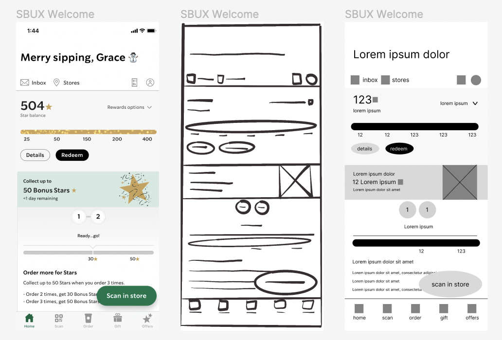
Page 1: Starbucks Welcome Page
The initial page welcomes users to the SBUX app and shows users their current status of points. The welcome page also may include current offers through the app like “Collect up to 50 Bonus Stars when you order 3 times”. As a former employee of SBUX, many customers have been confused as to what points earn. In making future changes to the app, I would most likely add icons under each point description. For instance, at 400 stars users can redeem for merchandise; I might include an icon of a bag of coffee. Another example could be a hot tea icon under 50 stars.
Page 2: Choose Store
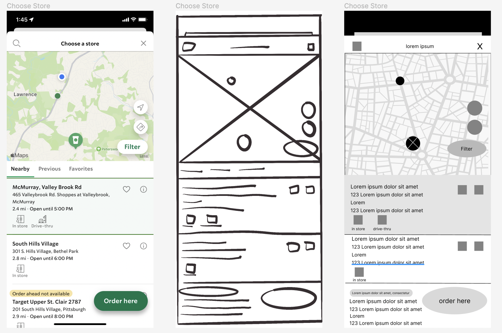
Page 2: Choose a Store
Before even looking at a menu, users have to choose a store to pick up the mobile order. On this page, users can see their current location on the map as well as a map of other SBUX stores in the area. On this page, users are able to select their desired location. In creating the wireframes, I felt that this screen could have been pushed to the 5th screen in the user flow. I personally feel that users should be able to browse the menu, before selecting a location to pick up.

Page 3: Order
Page 3: Order
This page describes various menu items that users can order. The default screen initially shows featured/seasonal menu items. Users can also see drinks that they have ordered in the past or favorite drinks. I feel that the “previous” and “favorites” categories are necessary subcategories as many customers order the same drinks every time they go to SBUX.
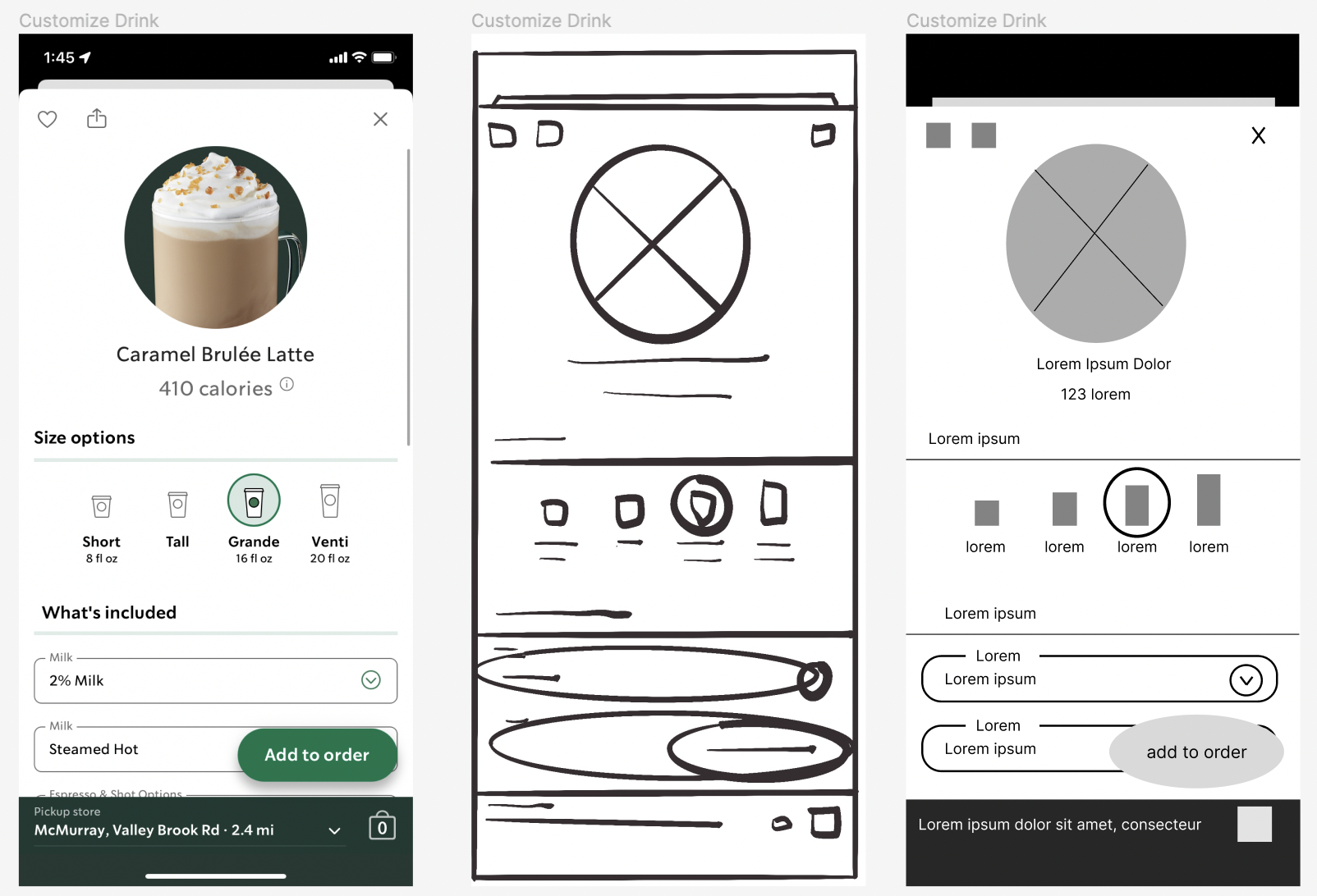
Page 4: Customize Drink
Page 4: Customize Drink
After a user selects a menu item, this customize drink page allows users to see sizing and nutritional information. Users are able to customize drinks and then add the customized drink to their order.
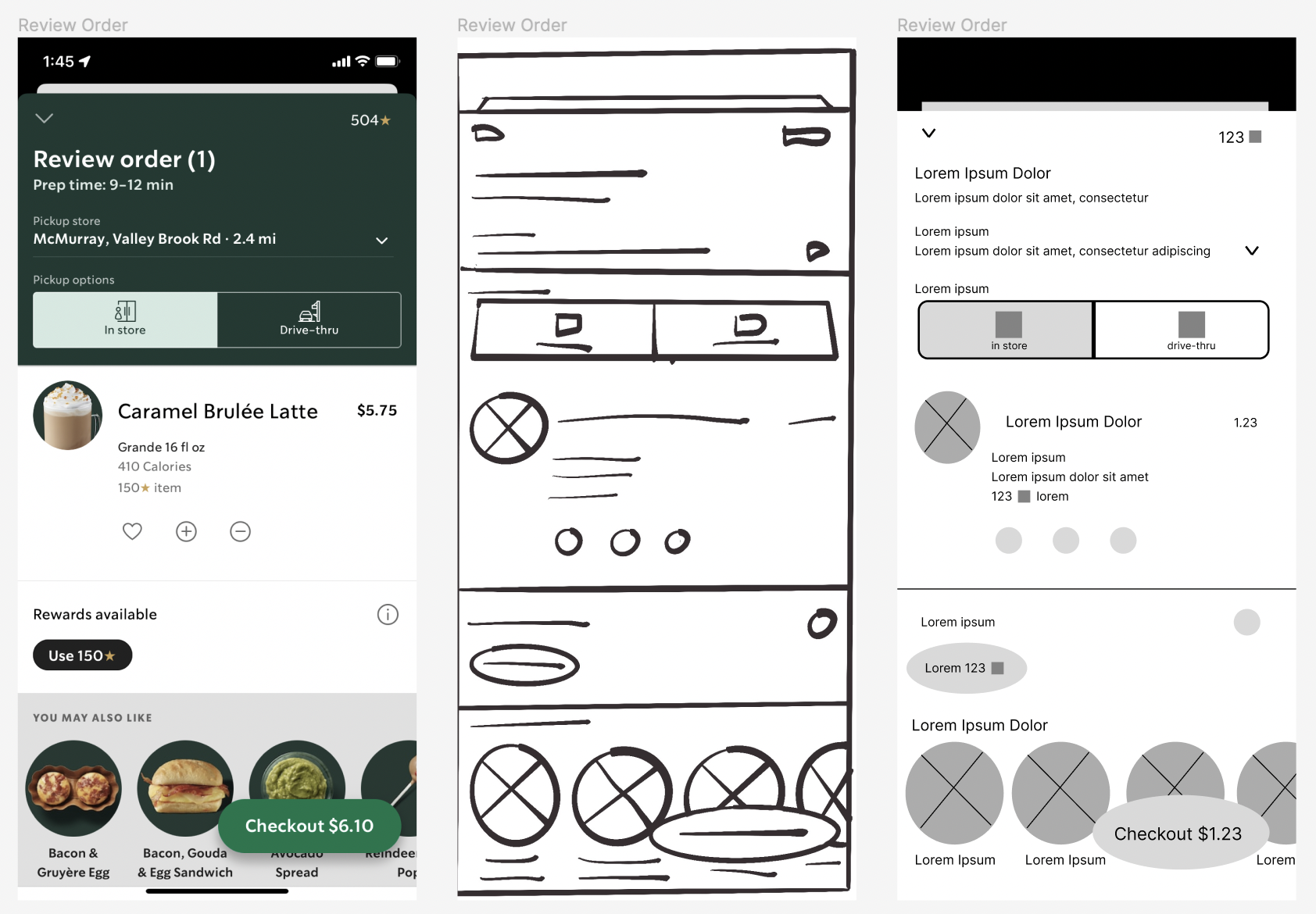
Page 5: Review Order
Page 5: Review Order
On the Review Order page, users are able to confirm their desired location and see the items added to their order. I feel that the “in store” and “drive-thru” buttons are not necessary. A barista at SBUX is not able to see if a customer is picking up in either place. This button only adds to the amount of clicks it takes to complete a purchase. I also feel that the map of the location in the “Choose a Store” page should be included in the “Review Order” page. There have been numerous times that customers will place a mobile order to the wrong location without noticing.

Page 6: Place Order
Page 6: Place Order
This is the final stage of the user flow of purchasing and placing a mobile order on the SBUX app. On this page users are able to select payment options like SBUX card, PayPal, or an option to reload their card. The option to use stars to pay for a drink was on the “Review Order” page; I feel that it should also be included on the “Place Order” page. In creating the high-fidelity wireframe, I noticed that there is a lot of negative space above the “choose payment” option. I feel that this negative space could be better utilized to possibly show account information. This negative space could possibly show how many stars a user would gain with this purchase, or how many they would loose if they are redeeming stars for their order.