UX Project: Swipe Out Hunger Website
For my User Experience Design class, we did a deep dive into the Swipe Out Hunger Website. We worked as a group for the first part of the usability case study, and then created prototypes as individuals.
During the summer semester of 2022, Arizona State University students in the TWC 444 User Experience class conducted a usability project on the website Swipe Out Hunger. The goal of the usability project was to work as a team to use user experience design approaches to redesign a website that fights food insecurity for ASU students who are out of state. In redesigning the Swipe Out Hunger website, ASU students are helping to achieve ASU’s Sustainability Practice Unit’s goals. The Swipe Out Hunger organization focuses on partnering with college campuses to end student hunger.
The Swipe Out Hunger website is a place for students to be informed about food insecurity and advocacy for the Hunger Free Campus Bill. The USDA defines food insecurity as “household level economic and social condition of limited or uncertain access to adequate food.” ASU students are aware that food insecurity is a concern for students on and off campus.
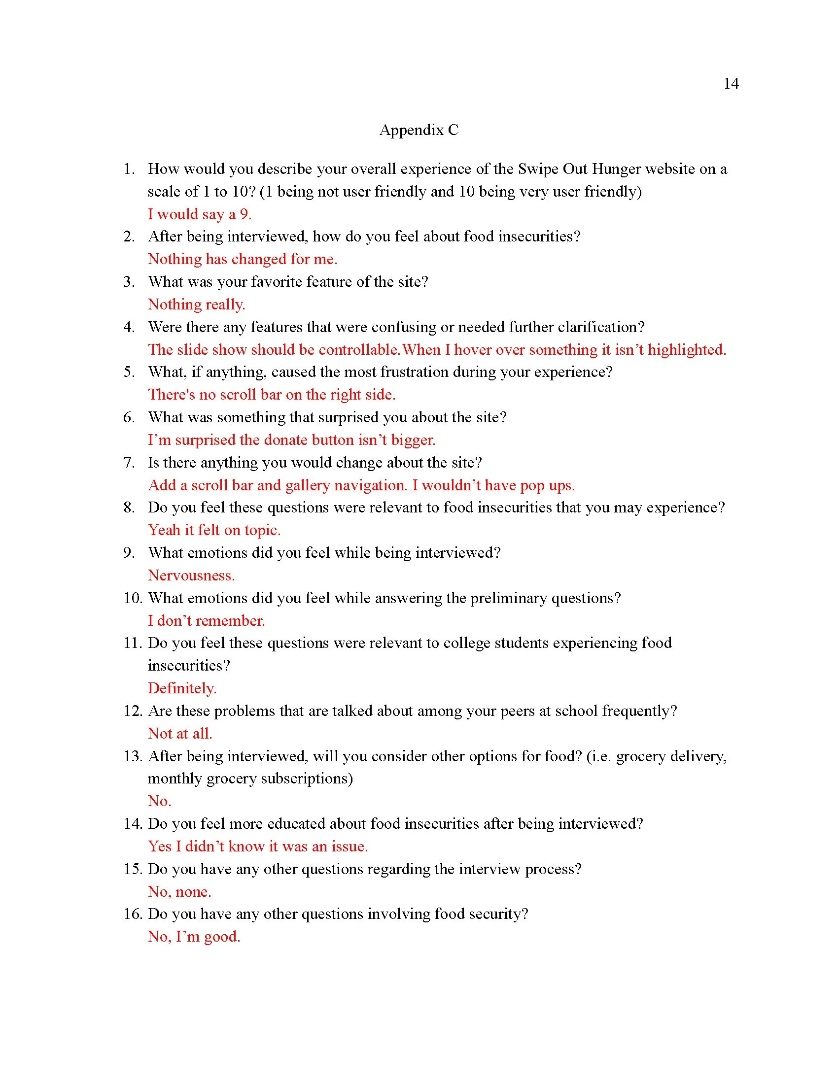
As a team, students conducted user research through google surveys to better understand the demographics of ASU students who may be suffering with food insecurity. The team conducted usability tests with participants who aligned with the team’s target audience. The usability tests examined the Swipe Out Hunger website’s ease of use in regards to visual appeal, efficient navigation, and relevance to food insecurity. Through performing the usability tests, the team was able to make conclusions to improve the Swipe Out Hunger Website to potentially help more students fight food insecurity.
Below are materials from the Project:
Research Report
User Personas
Sample Meeting Agenda
UX Redesign Narratives: Concept Story
Sketch Prototypes
Final Mockup of User Flow
Retrospective of Final Mockup


Concept Story:
A concept story illustrates the big picture of what a product or service is. This concept story goes through how a user would interact with the Swipe Out Hunger website.
“Jamie is a college Freshman living in a rural middle class area of Georgia. She has never struggled with food insecurity and prefers to eat out for convenience due to her work and study schedules. Being that she lives in a rural area, she witnesses some fellow classmates going through food insecurity with more vigorous work schedules than herself. Jamie wants to see what information she can obtain from the Swipe Out Hunger website to give her classmates some insight on how to fight their food insecurity struggle. While browsing the site, she notices that Swipe Out Hunger is partnering with schools to offer more affordable meal plans for battling this issue. While browsing the Swipe Out Hunger website, she noticed the section where you can see if the school you’re attending is eligible for the program and found out that Jamie’s school is eligible for the program. Knowing that her school qualifies for the program, she informs her classmate, Sarah. Sarah was very grateful for this information because she has been struggling with food insecurity for a while now, and did not have time to research resources for herself. Excited to share her findings, Jamie and Sarah take a brief moment together to look at the website to find resources that can help Sarah. Jamie helps Sarah find affordable meal plans at school, which gives her a sense of accomplishment and desire to help more people that attend her school. After helping out Sarah, Jamie realizes she can help more students at her school. Jamie finds a page on the Swipe Out Hunger website that allows Jamie to be a Swipe Out Hunger advocate for her school, and quickly signs up. Even though Jamie isn’t struggling with food insecurity, the sense of accomplishment she got from helping out her fellow students brings a light to her life. The countless students that she has helped thus far from advocating Swipe Out Hunger could not be more grateful for her help and support.”


Below is the Final Mockup of the user flow:
Based on usability tests, my group saw that many people were confused on specific terms. For instance, some users did not know of a Hunger Free Campus Bill. Some users commented that as they learned what terms were, the site was easier to navigate; however, users still had to learn terms on their own. This prototype of a user flow proposes the idea of a preliminary survey for new users on the Swipe Out Hunger website. This survey is able to assess a new user’s prior knowledge and direct them to the most relevant links based on this information.
Here is an interactive link: https://xd.adobe.com/view/63783cf9-b88a-4448-87ad-863a7ed7862f-362b/?fullscreen&hints=off


